F&B | CAFE | UX DESIGN | WEBSITE | STUDENT WORKPHILZ COFFEE
WHY
Student Project, GA
TIMELINE
2 weeks
ROLE
Product Designer,
UX/UI, Research
HOW
Figma, Illustrator
INTRODUCTION
As a part of one of my projects at General Assembly, I had to choose a local shop that needed a website redesign. Ever since I moved to California, Philz Coffee has been my go-to coffee house. Local to San Francisco Philz has one of the best in-store customer experiences and I wanted to create a similar experience for them online.
LET’S BEGIN
To start off this project I looked over at Philz Coffee as a brand and tried to get a better understanding of who its target audience is.
Philzs’ brand was built on pillars like - being a part of the community, quality, having a personality, and inclusivity!
All of which I intended to maintain. After speaking to some of their customers in-store I came to a conclusion of who their audience was - The Careful Critic. Quality is of utmost importance to them, they take time and read reviews before making any purchasing decision, and they compare products to find the best one.
LET’S MEET ~ DAVID ROSE
David Rose lives in the city of San Francisco and works as an information designer by day and an avid coffee connoisseur by night. His guilty pleasure is falling into the Wikipedia hole when he is reading up about new things. David loves to know everything he can about his favorite things! Recently his work has asked for too much of his time, so he has not been able to enjoy a Thursday evening coffee at his favorite local coffee house - Philz! He has to buy his monthly coffee online now, so he’s banking on other people’s reviews and advice on different brands. He is disappointed in the constraints of Philz’s website and misses the vibe and interactivity of the real place.
“David needs a more interactive and systematic website for his local coffee shop so that he can efficiently browse and order his favorite coffee with the same experience he used to have at the cafe.”
PROBLEM STATEMENT
‘HOW MIGHT WE’
SOLVE THE PROBLEM?
Make coffee the forefront of the website
Bring the real-life cafe experience online
Make ordering coffee online a more intimate & personalized experience
Help users filter/sort products
to make better decisions
Give users enough information they
need to convert a need into a purchase
Use past order to give
better recommendations,
in turn increasing sales
WHAT WORKS
To get a better understanding of Philzs’ website I conducted a Heuristic Evaluation, where I evaluated and documented everything that worked in favor of the brand and what didn’t. To validate our findings we asked users to go through the website themselves, while we conducted Contextual Inquiries by recording their reactions, time taken, pain points, etc. (Images from Philzs’ previous website design)
WHAT NEEDS WORK
HEURISTIC EVALUATION
WHAT USERS SAID
CONTEXTUAL INQUIRIES
A comment that struck me was when a user said that the website was just “okay”. Philz Coffee is much more than okay so it was time for a redesign!
COMPARE AND PRODUCE
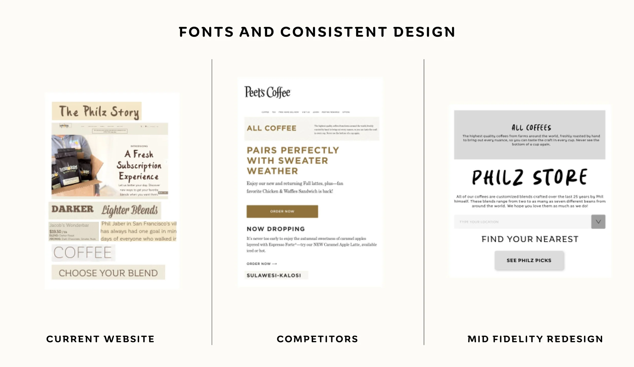
I continued with my secondary research and conducted a Competitive Analysis. Here I have compared different sections between Philzs’ website, what our competitors are doing, and redesigns that I proposed as mid-fidelity designs to solve the problems that came up during the analysis.
— our users felt more lost than in control —
SO LET’S DECLUTTER
Keeping our constraints of time in mind, I dived deeper into our own website and prioritized the key features that were needed to make an M.V.P (Minimum Viable Product). I used the Card Sorting method to help me create an Information Architecture plan for our web pages.
USER FLOW
TASK : Add a coffee of your choice to cart and checkout as guest
LETS GET OUR HANDS DIRTY
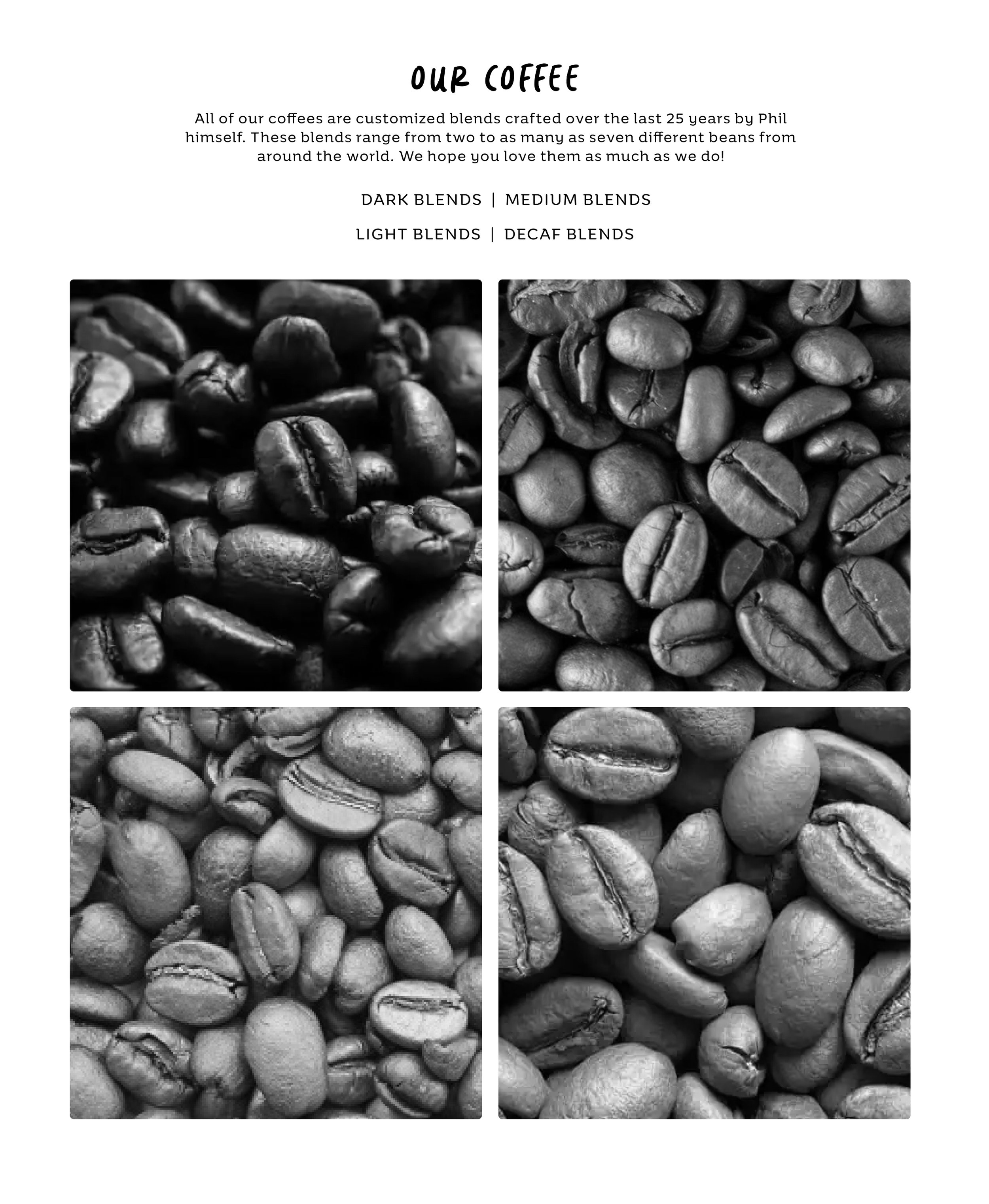
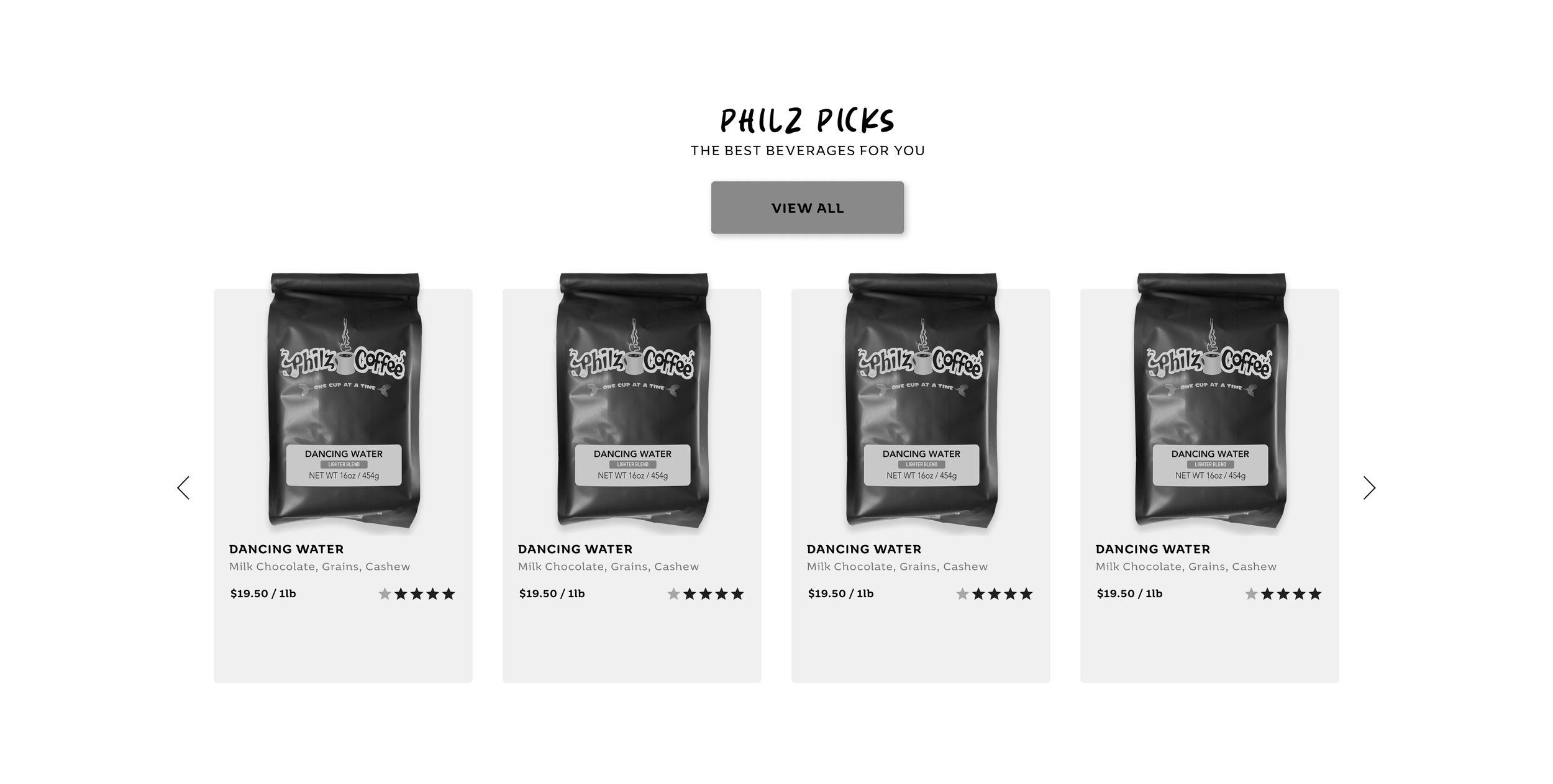
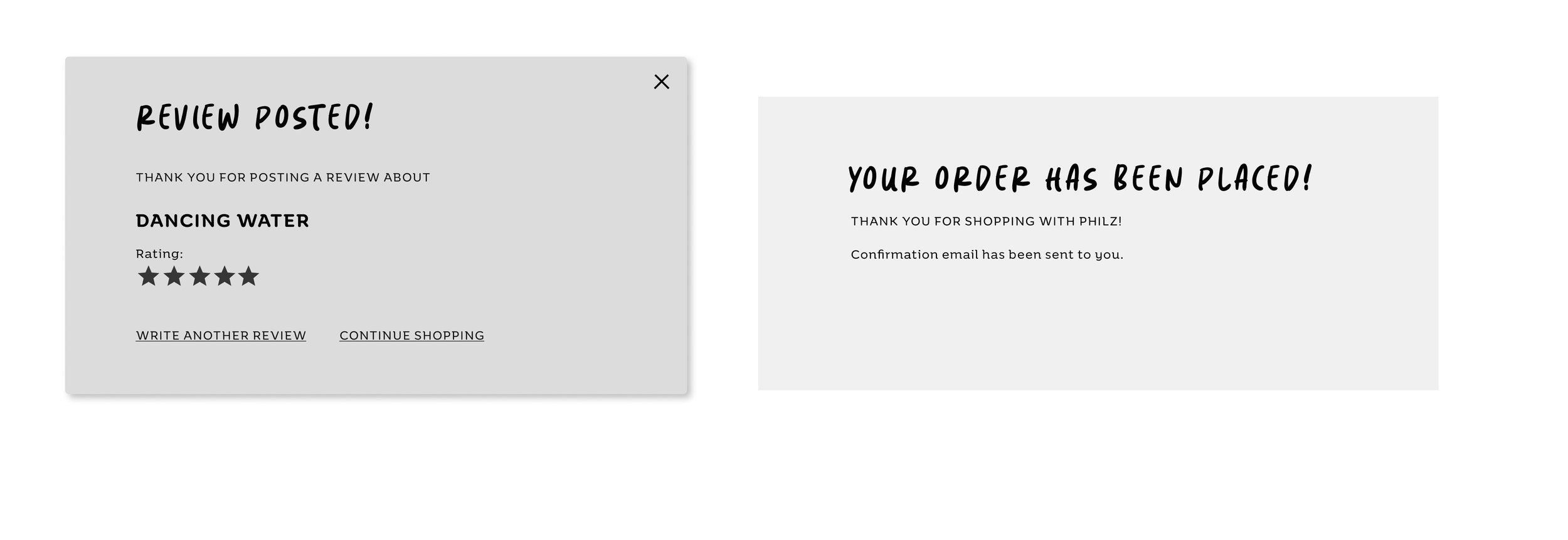
I sketched out a skeleton for the web pages that were needed to fulfill David’s user journey. Based on those sketches I created
Mid-Fidelity wireframes.


TIME TO JAZZ IT UP
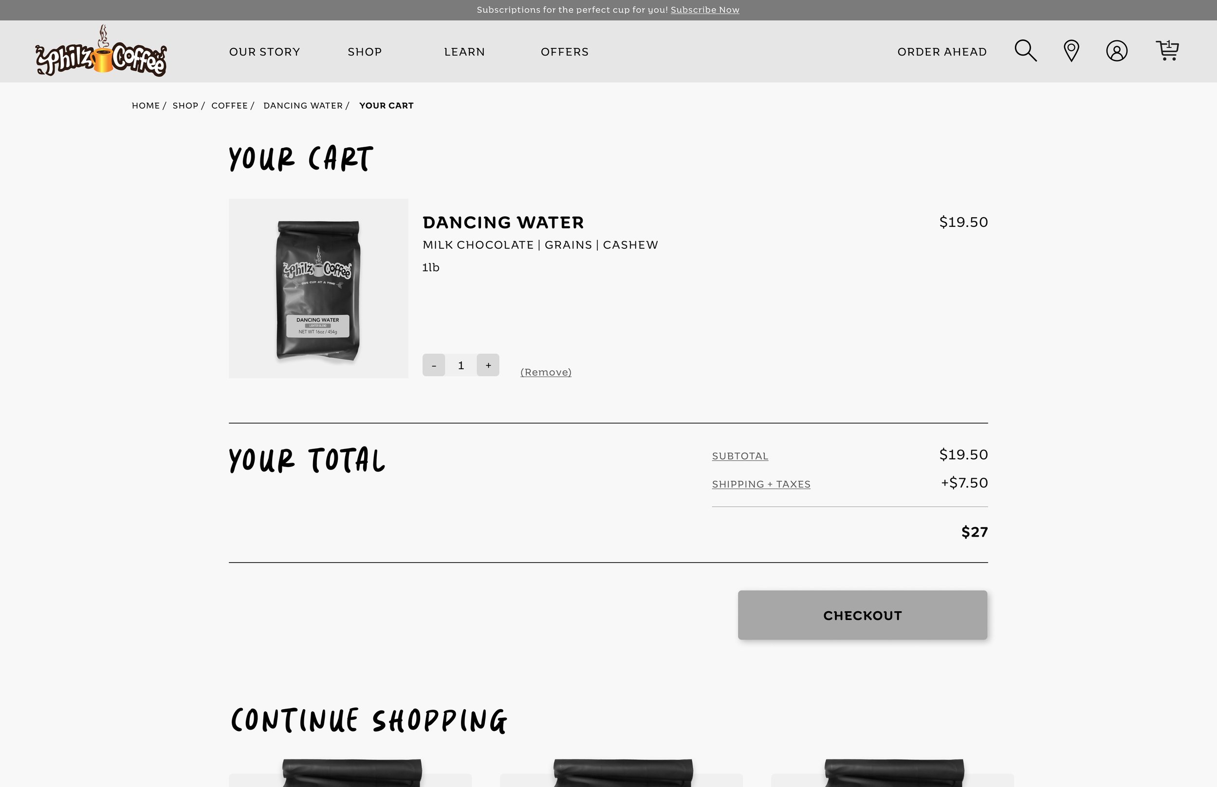
Our tried and tested Wireframe was ready to become a High-Fidelity Prototype. It was time to add some UI and interactive elements like colors, typography, images, card displays, hover animations, and selection variants to the prototype. It was time to jazz it up!
I made sure to maintain the essence of Philzs’ brand as it has a strong fan following. Making any drastic design changes would disturb the users causing a bad user-experience.
Therefore for the sake of consistency - brand colors, typefaces, dark background, and image display style were kept relevant.
We finally consolidated all our learnings and re-designed the website for Philz Coffee.
Click to see a working prototype!
Prompt - Add your favorite coffee (psst: It’s “Dancing Water”) to your cart and checkout as a guest!


