


FILMS | UX DESIGN | WEBSITE | STUDENT WORKLETTERBOXD
WHY
Student Group Project, GA
TIMELINE
2 weeks
ROLE
Lead Planner,
UI Designer, Research
HOW
Figma, Illustrator
INTRODUCTION
Letterboxd is a social app focused on sharing opinions about, and love of film. Members can use it as a diary to record their opinions, keep track of films they want to see, and interact with other cinephiles.
THE PROBLEM?
After evaluating their website in more detail, my team and I concluded that although Letterboxd had a solid user base, it lacked an efficient user experience. With accessibility issues and repetitive and confusing actions as the core problem — we set out to improve this platform!
LET’S FIND OUR USERS
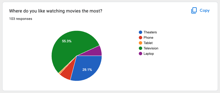
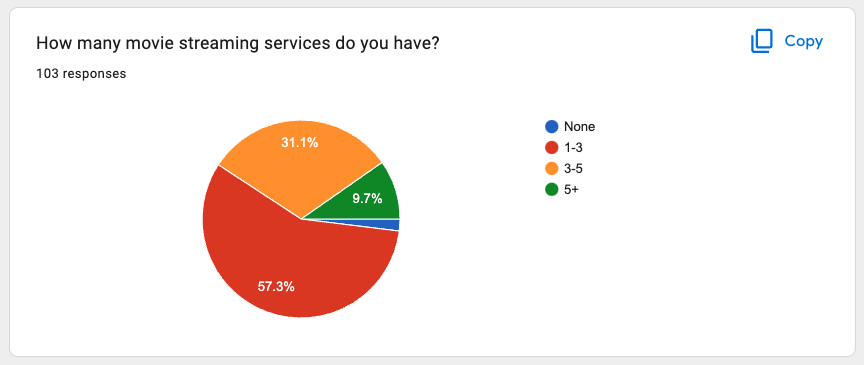
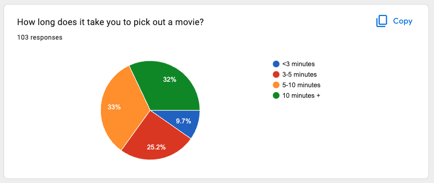
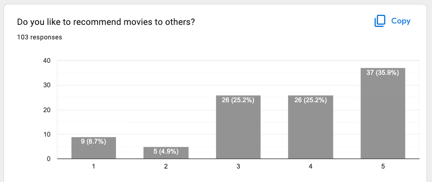
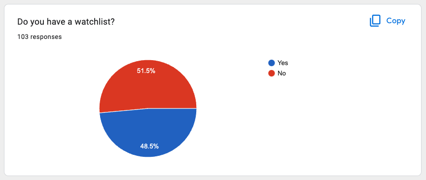
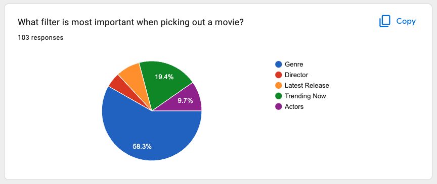
To begin with, we conducted an online survey that reached 103 applicants. We got valuable information on things like-
who our audience was, their demographics, how often people watch movies, how they search for films, their decision-making process, whether they read reviews and cared about ratings or not, and what they depended on while choosing a film.
We then carefully chose 15 people to further conduct user interviews based on these data points and validated our thoughts.
MARKET RESEARCH
How often do we find ourselves looking up ratings before visiting a restaurant or buying a product online? 80% of users rely on peers’ reviews of things. The same principle can be applied to films as well. According to Bloomberg, this year Critics and Fans have never disagreed more about films. With such opposing views and a generation that relies heavily on opinions, Letterboxd has become such an important platform as they are based on user-generated ratings and reviews of films.
Click on images to drag and see more of the survey!


WHAT OUR USERS THINK
After conducting 15 user interviews with our target users, we consolidated the information we got from them through a technique called affinity mapping. Mapping out quotes, preferences, likes and, dislikes of all the interviewees gave us a lot of insight into the user’s mental models. We then used these insights and similarities to build out “i” statements to help empathize with the audience and categories that worked for our product. Let’s map these out!

THE INSIGHTS WE GAINED
“I statement” | THE INSIGHT
“I hate it when a movie has a bad ending”
AVERAGE RATING FOR MOVIES
“I like reading reviews to manage my expectations of the film”
REVIEWS SECTIONS
“I like to know all of my options on where to watch a movie”
FILTERED/STREAMLINED SEARCH
“I appreciate the segregation of movies by genre”
GENRE SORTING
“I like getting personal recommendations on what to watch”
PERSONALIZED CONTENT
LET’S MEET ~ FLYNN
Flynn is a budding barista. He is constantly brewing new flavors and snapping some shots as a freelance photographer. Living in San Francisco he is as boho as it gets. He has found a community of people with similar interests, who have now become his family. He is constantly doing something unique and loves keeping up with trends and knowing what’s up. He prides himself in the film recommendations he gives and banks on the opinion of others. His idea of a relaxing evening is watching a good movie and adding it to his list of greats. A bad movie watched is time wasted for Flynn. And that’s where Letterboxd steps in —

PROBLEM STATEMENT
Our group then consolidated all the insights we had gained and worked together to form one statement that would sufficiently mark Flynn’s problems. This statement would form the constraints of our further research and guide us in drawing up valid solutions.
“Flynn needs a functional and reliable source to find movies because he will regret wasting his time on a movie that did not live up to his expectations.”
HOW USERS FELT ABOUT LETTERBOXD
We discovered some violations in Letterboxds’ website through a research tool called Heuristic Evaluation, where we evaluated the website and pointed out any design or technical flaws, and also made a note of what worked. We used a rating scale of 0-4. (0=Perfect | 4=Poor). To validate our findings we asked users to go through the website themselves, while we conducted some Contextual Inquiries. Images from Letterboxd's current website.
LEARNABILITY (5)
the navigation bar is not consistent | unfamiliar icons | no accurate breadcrumbs
USERS SAID
“I don’t know what these icons mean,
can’t even read what’s written!”
“Why are there so many options?”
“What does log mean?”

EFFICIENCY (4)
not enough text contrast | confusing reviews format | repetitive actions | unclickable items
USERS SAID
“What does this graph do?”
“Are review and log the same thing?”
“not sure...where I am right now”

MEMORABILITY (4)
- inconsistent hover actions for tabs and buttons | inconsistent use of brand colors
USERS SAID
“This website feels outdated and boring”
“Why does it not remember my input?”
“Wasnt this menu something else?”

— our users felt more lost than in control —
WHAT ARE OUR COMPETITORS DOING?
For our secondary research, we conducted some Competitive Analysis. We looked into what our competition was doing that works and what doesn’t and mainly focused on what is missing on Letterboxd, We got some key takeaways from this to implement in our designs.

FEATURE ANALYSIS

PLUSES & DELTAS
After looking at our competitors and evaluating all the insights we had gathered from the user interviews, we went ahead and shortlisted 3 features to incorporate in Letterboxds’ redesign.
A STREAMLINED SEARCH PROCESS
stream search by - streaming platform / home / theatre
ALLOW USERS TO BROWSE MOVIES
the films tab to be a whole page
USE PREFERENCES FOR PERSONALISED CONTENT
suggested movies for you
NOW LET’S DECLUTTER
Continuing our secondary research, and keeping our constraints of time in mind, we dived deeper into our own website and prioritized the key features that were needed to make an M.V.P (Minimum Viable Product). That also helped us create an Information Architecture plan for our web pages.
NAVIGATION BAR
leave only what is most valuable to users with a clear CTA
REVIEW BUTTON
clear and quick information on ratings
FILTER & SORT LISTS
retain only 2 filter categories - Genres & Popularity
GENRES SEGREGATION
giving film genres more importance than a drop-down list
REVIEW SECTION
neatly sorted for easy understanding
INFORMATION ARCHITECTURE

USER FLOWS
TASK 1
Add a movie to your Watchlist based on Ratings & Reviews

TASK 2
Read & Write a Review, and reply

LETS GET OUR HANDS DIRTY
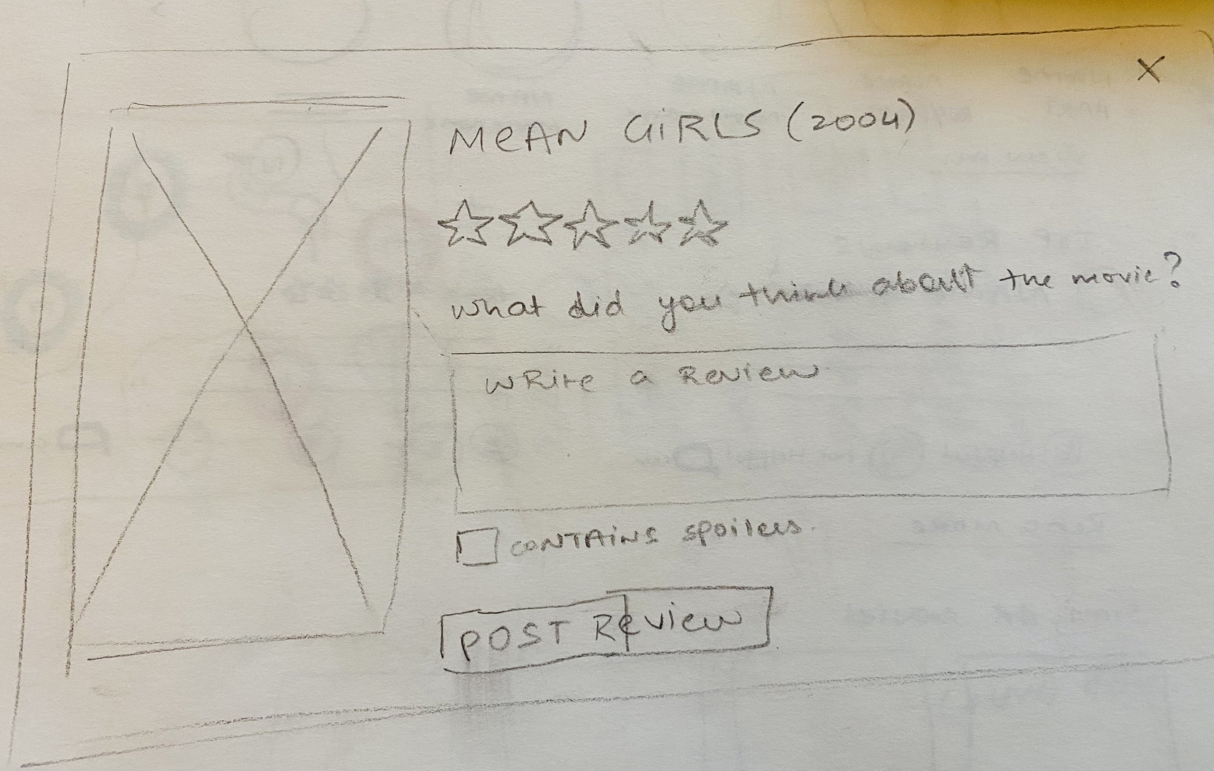
We then created some Lo-Fidelity Sketches and marked out all the important pages we needed to fulfill Flynns user journey. This became the skeleton for our mid-fidelity wireframes.
Click and drag to view all Sketches!

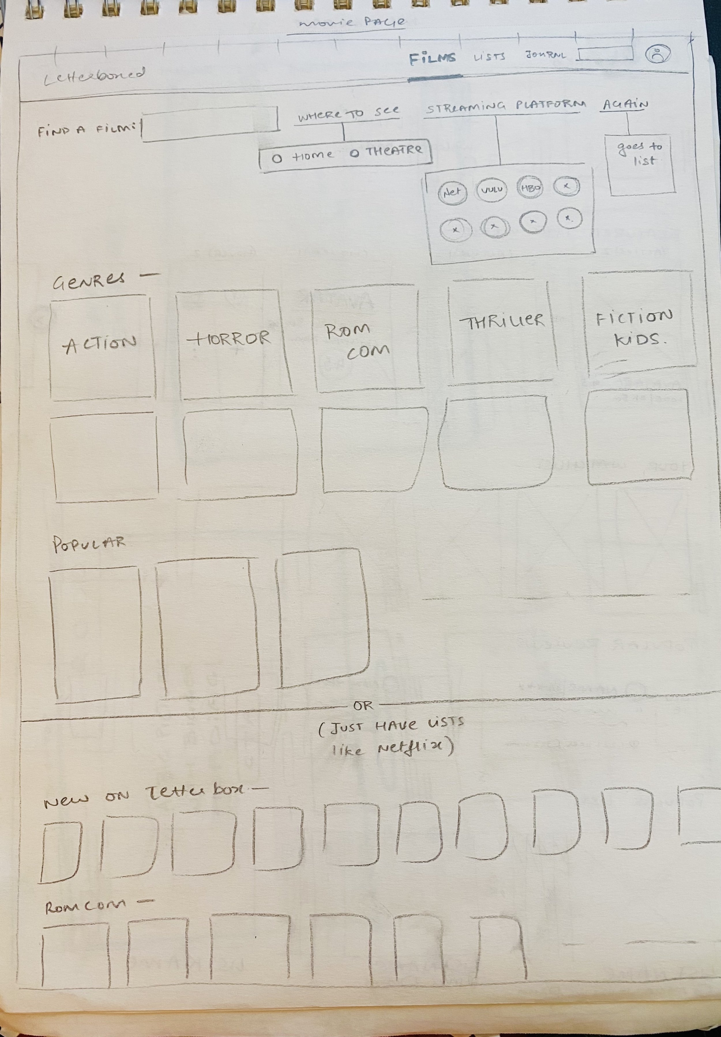
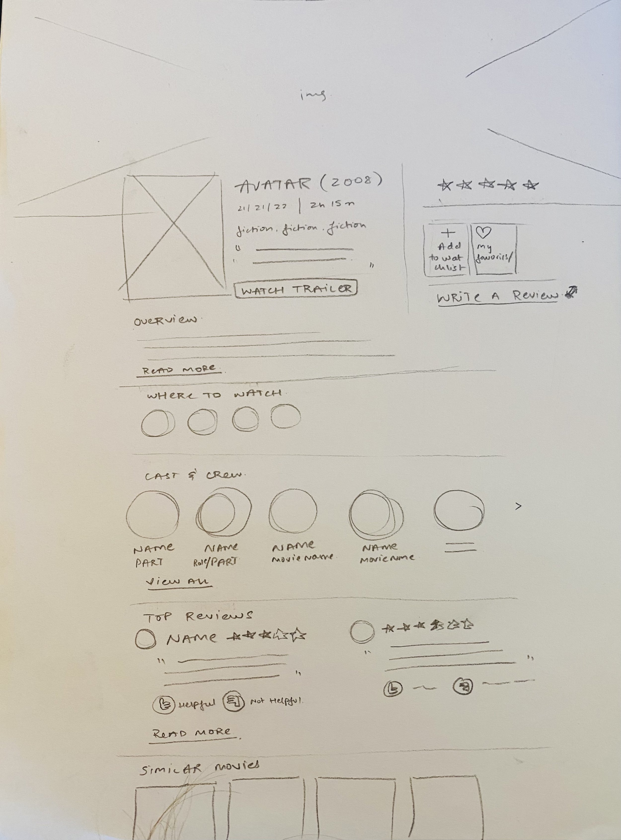


WIREFRAMES

LET’S TEST IT OUT
After our Mid-Fidelity Wireframes were completed, we went on and conducted Usability Tests. We got 5 users to test out the wireframes by asking them to complete 2 user tasks (mentioned above). We recorded their journeys and made a note of their reactions. After gathering all our data we made recommendations based on each user's experience.
THE PAIN POINTS

OUR RECOMMENDATIONS
5/5 users were confused with repetitive functions like “Where To Watch”
5/5 users wanted a “Suggested For You”/ “Similar Movies” section
4/5 users need more than an icon to indicate what the function of the “Add to Watchlist” & “Write a Review” icons were.
3/5 users wanted an “Already Watched” option to mark movies off their watchlist
2/5 Users didn’t know if each review was clickable
TIME TO JAZZ IT UP
Our tried and tested Wireframe was ready to become a High-Fidelity Prototype. It was time to add some UI and interactive elements like colors, typography, images, card displays, hover animations, and selection variants to the prototype. It was time to jazz it up!
I made sure to maintain the brand essence of Letterboxds’ current website as it already had a very strong fan following. Making any drastic design changes would disturb the users causing a bad user-experience.
Therefore for the sake of consistency - brand colors, typefaces, dark background, and image display style were kept the same.
We finally consolidated all our learnings and re-designed the website of Letterboxd.
Click to see a working prototype!
ACTION - Don’t forget to add a movie you want to watch (hint: Elvis) to your watchlist, and while you’re there, write a review for your recent watch “Pulp Fiction”